︎ Graphic Design
︎ Fiber Art
︎︎
About
giannazanzi@gmail.com
GIANNA ZANZI © 2021
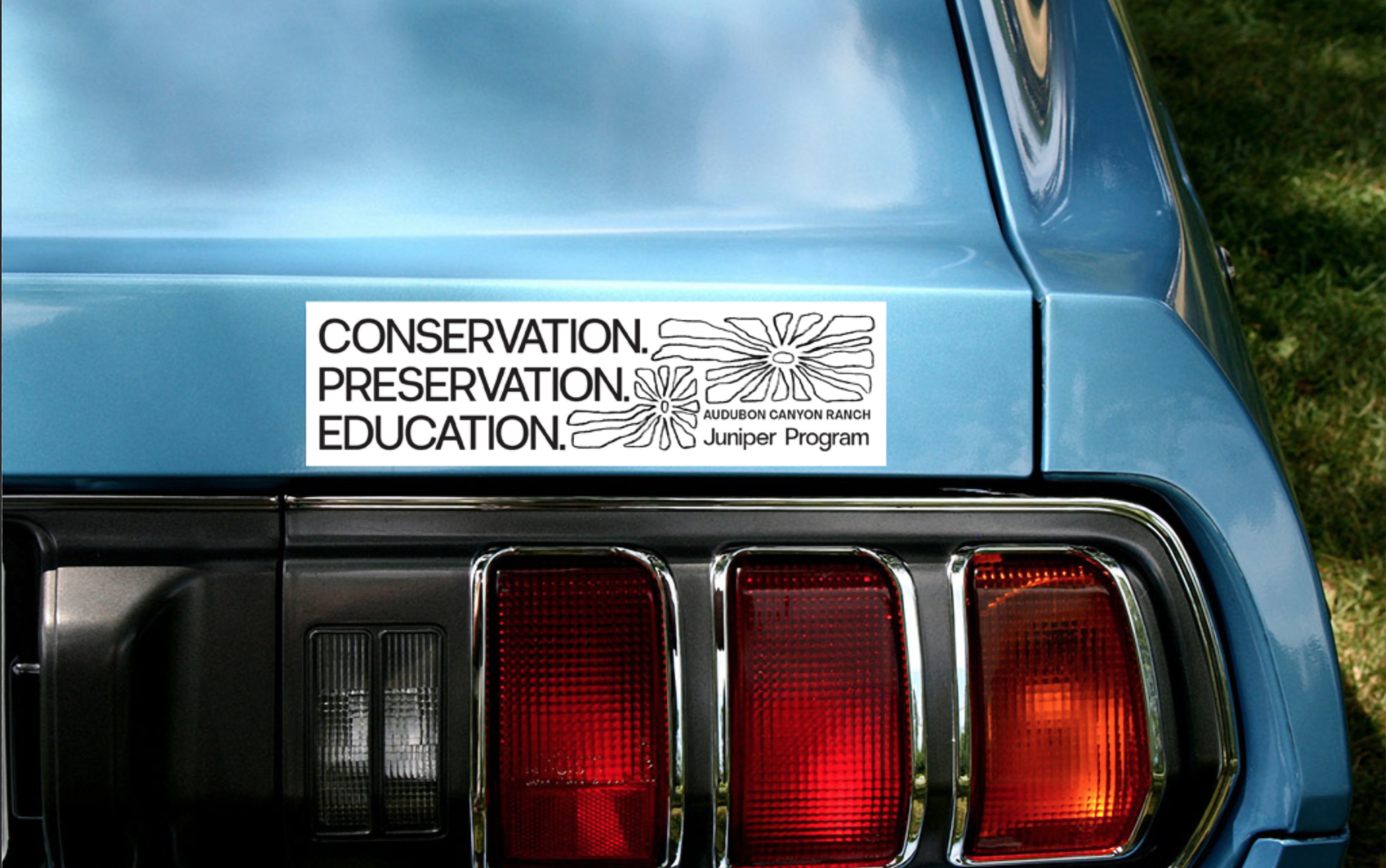
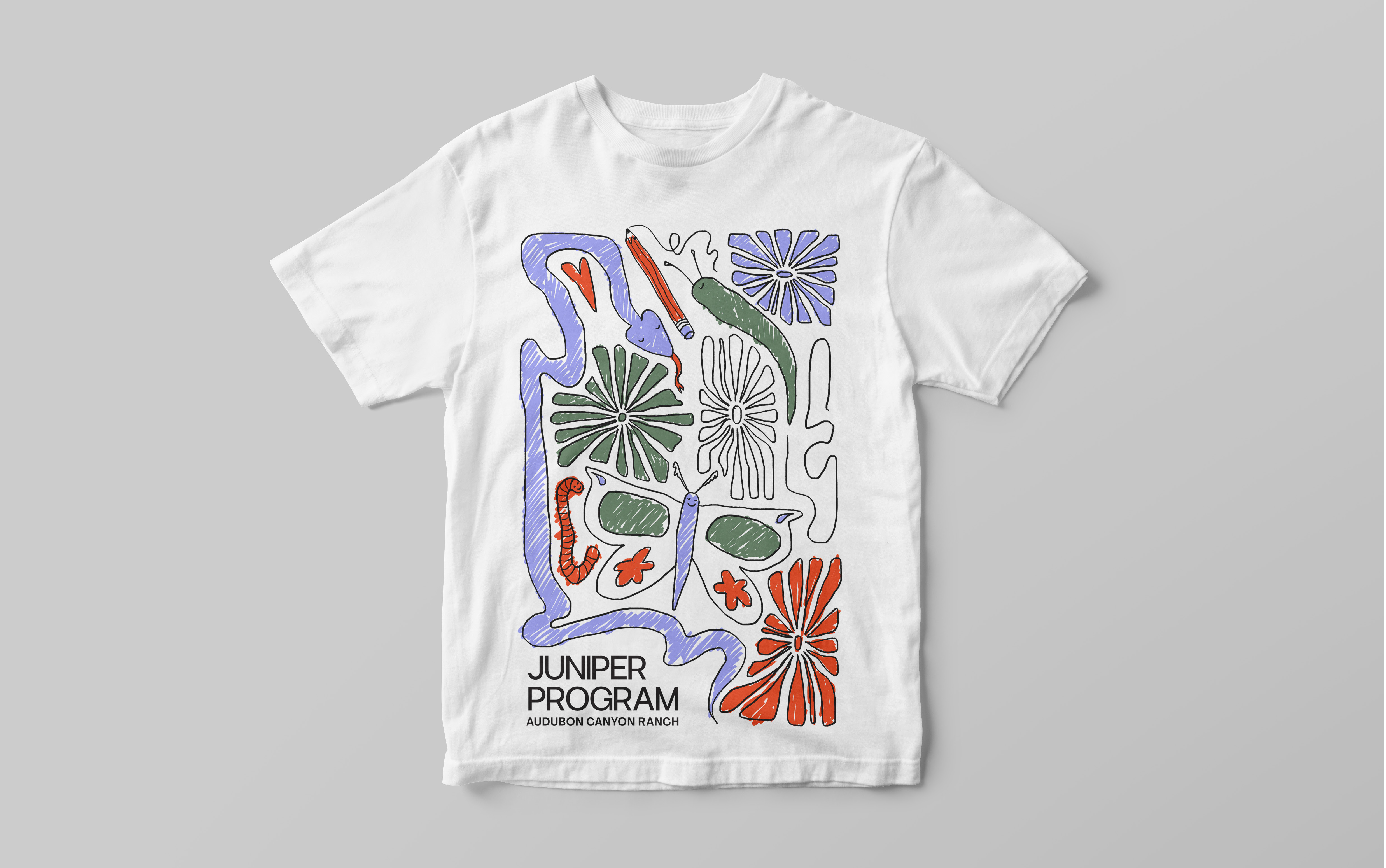
Juniper Program Campaign,
Booklet & Collateral, 2020.
Dedicated to teaching elementary school children about nature conservation and wildlife preservation, Audubon Canyon Ranch’s Juniper Program is based in Glen Ellen, CA, just north of San Francisco. The goal of this campaign was to bring consistent branding across Audubon Canyon Ranch’s printed & social media, as well as to bring the fun of the program to its visual identity.


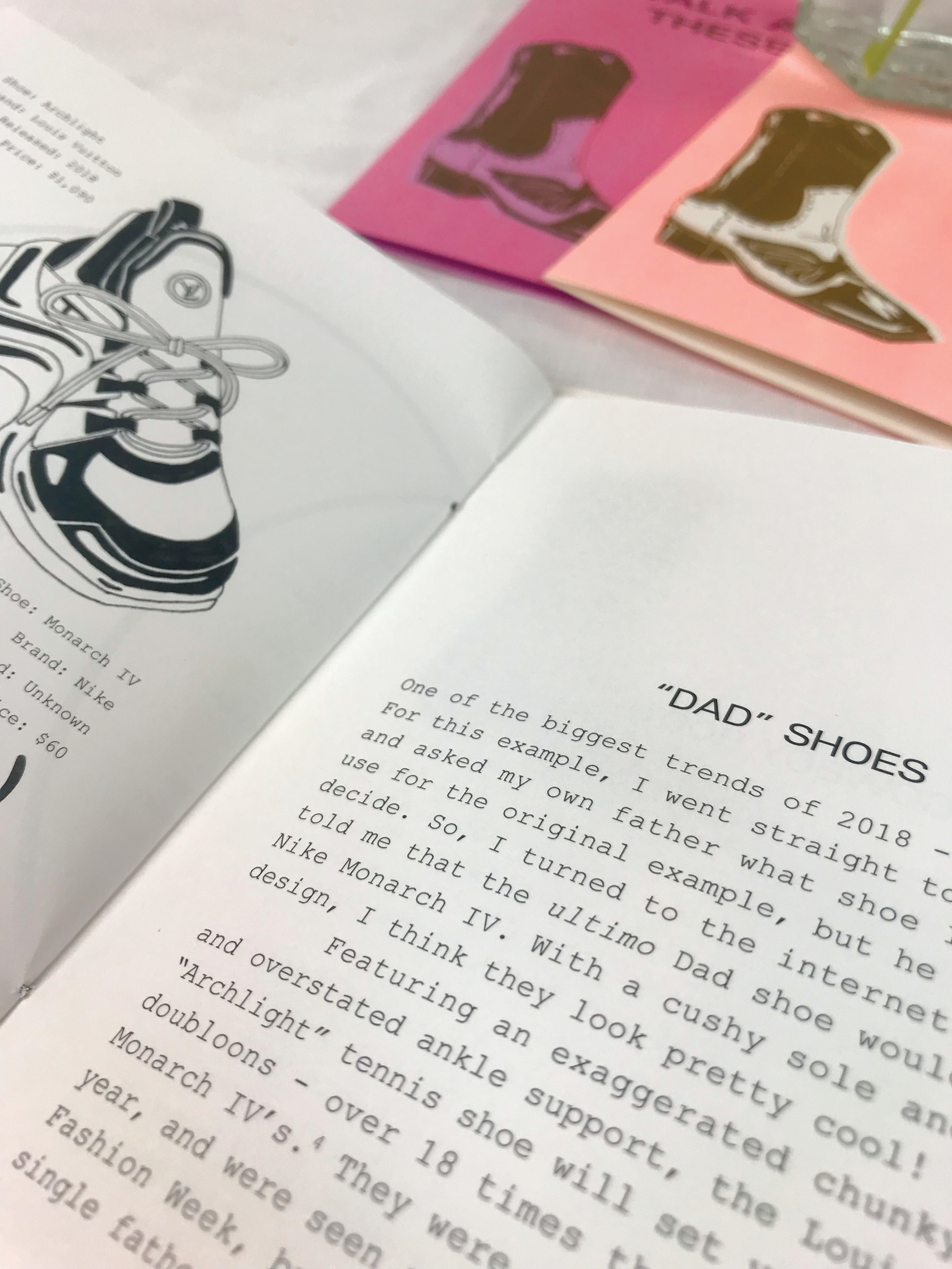
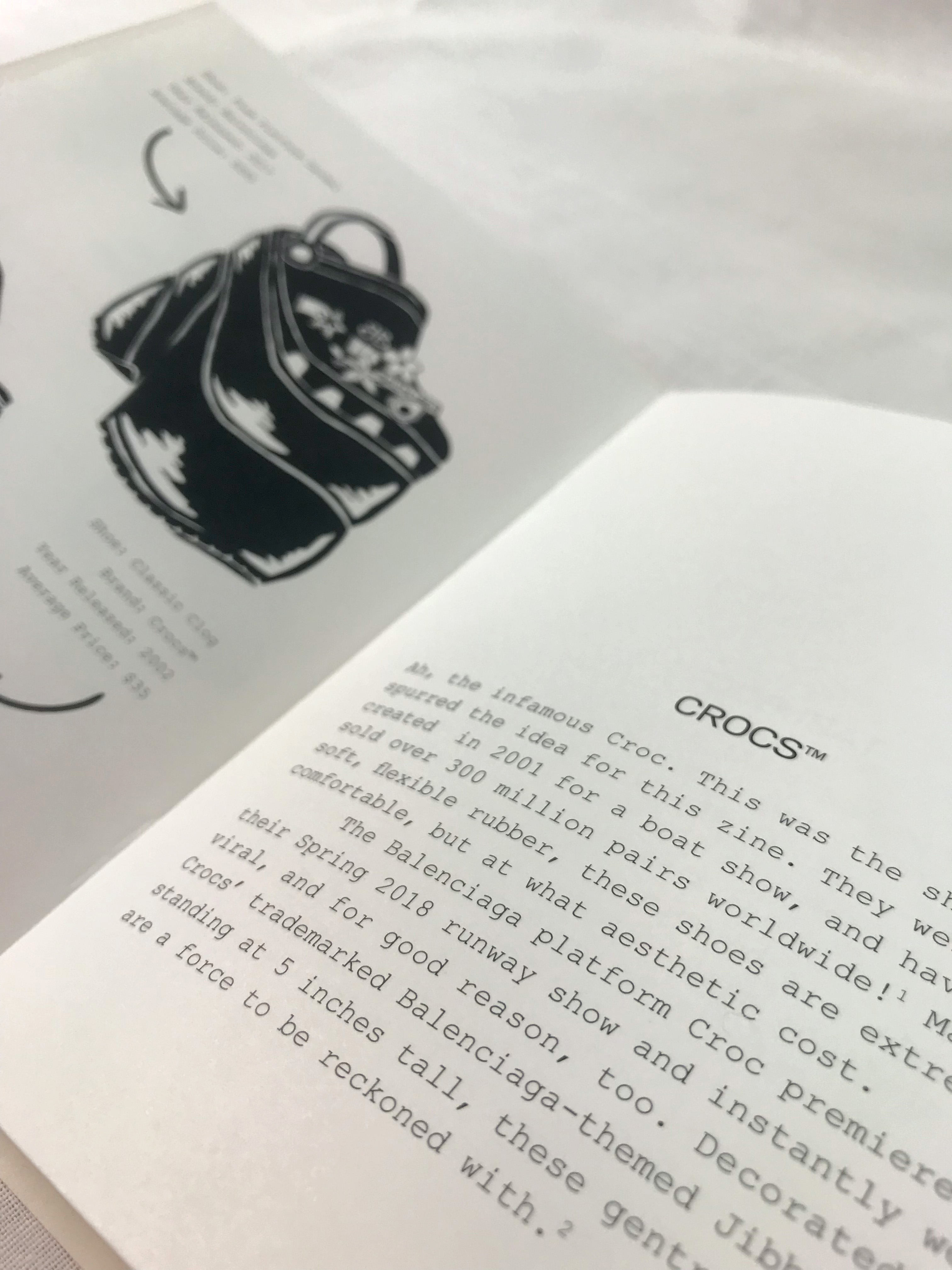
Walk a Mile in These Shoes,
Zine, 2018.
This Risograph-printed zine, Walk a Mile in These Shoes: The Lives and Times of Gentrified Footwear, takes a look at the history of some of the world’s most famous shoes through a critical-yet-factual lens. The booklet is aimed towards fashion-admirers, those in need of some levity, and anyone in between.


HAIM Lyric Visualizer,
Motion Design, 2021.
This is my final animation project for my Intro to Motion Graphics class that I took in my final term at Portland State University. This lyric visualizer video is for the HAIM song, “Summer Girl,” which is a bonus track from their newest album, Women in Music Pt. III. I love this song for its summery, Lou Reed kind of feel, and echoed this mood through the use of archival footage of Los Angeles from the 1950s and 60s, and in the sunshine-yellow text and illustrations.
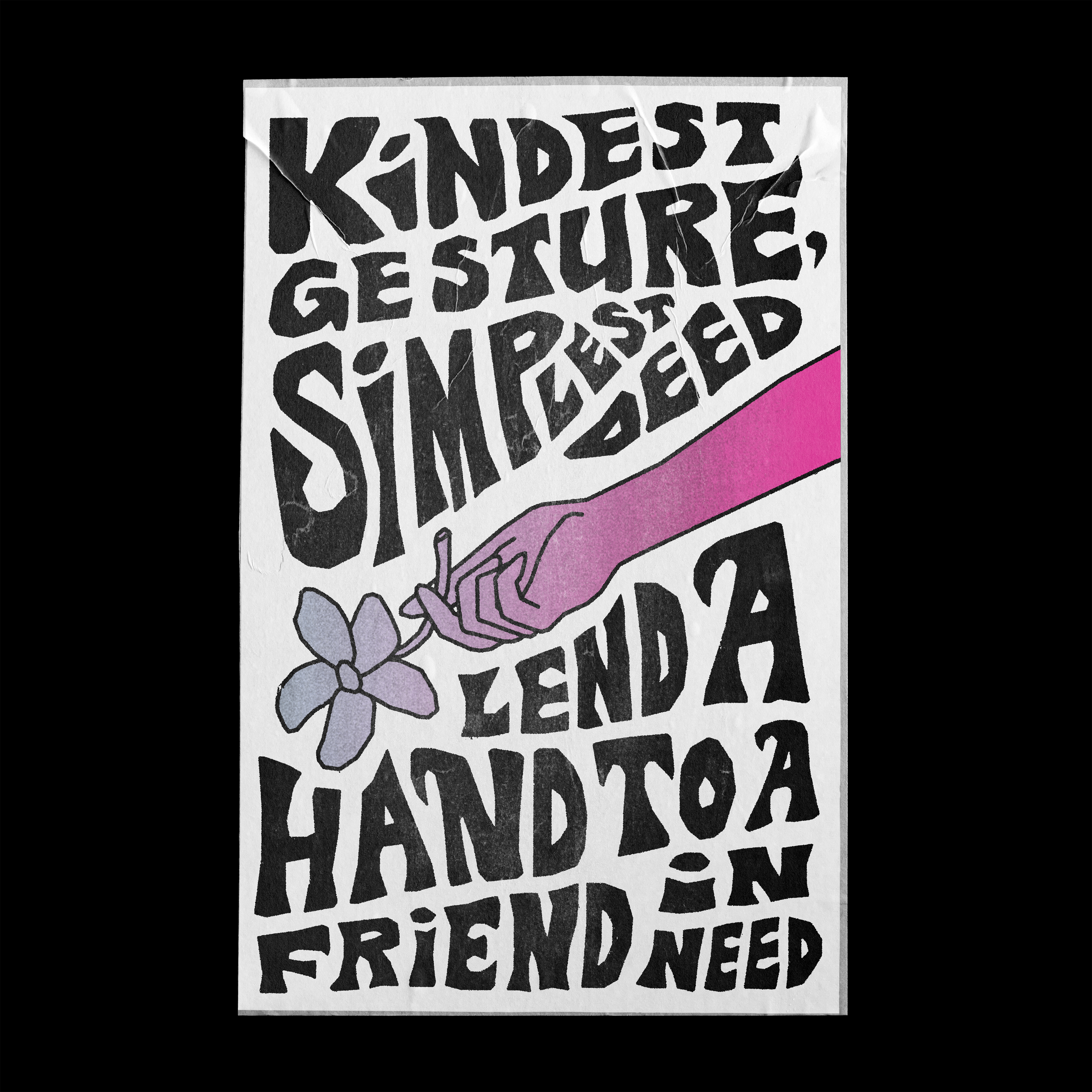
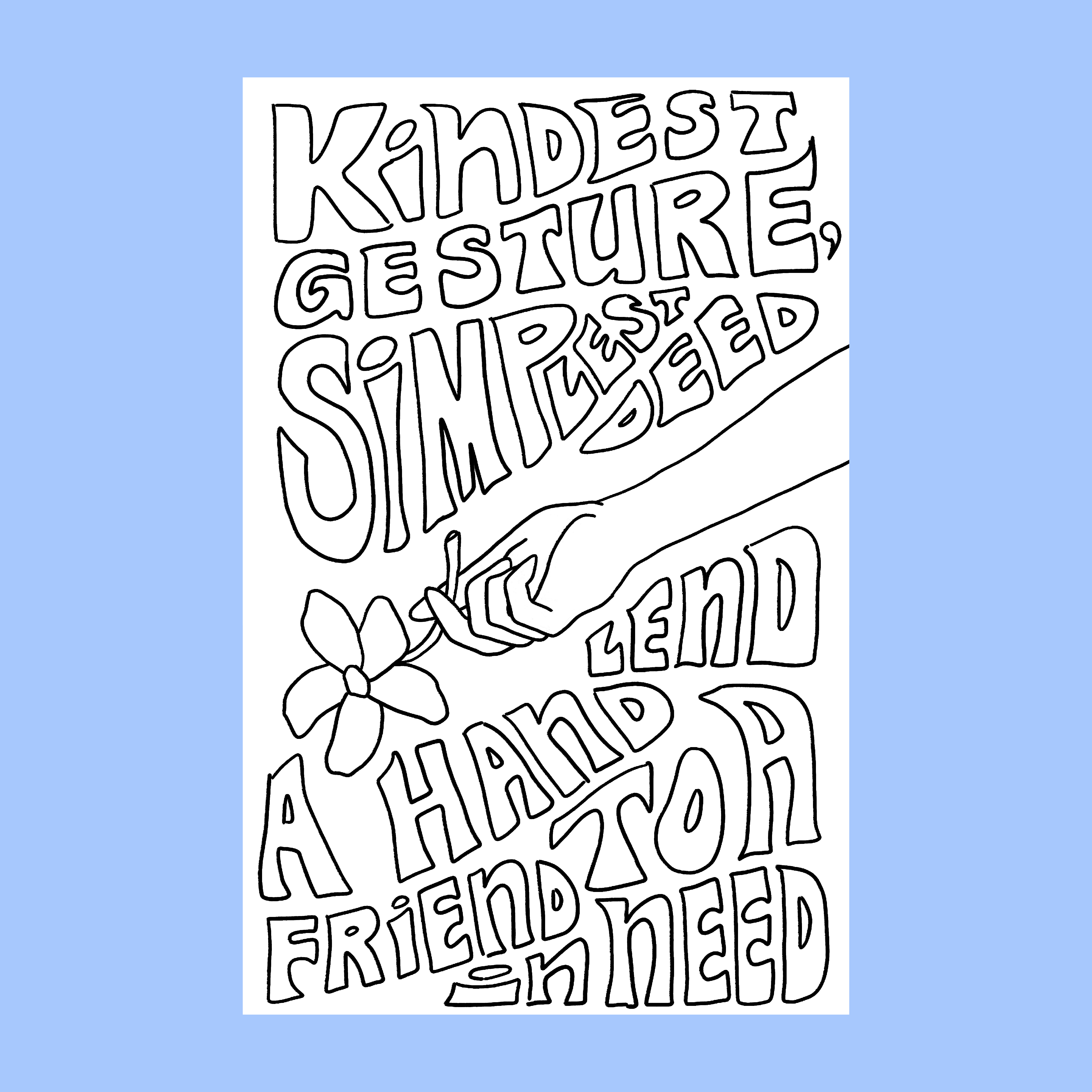
“Kindest Gesture,”
Poster, 2020.
This was a poster that I had made for a screenprinting workshop in the Fall of 2020. The goal of our workshop was to make a poster based on a “call to action” prompt, and after I had spent an evening brainstorming the copy I would use, I really loved getting the chance to also learn more about the history of woodblock type in posters, as well as how to incorporate the split-fountain process into screenprinting.

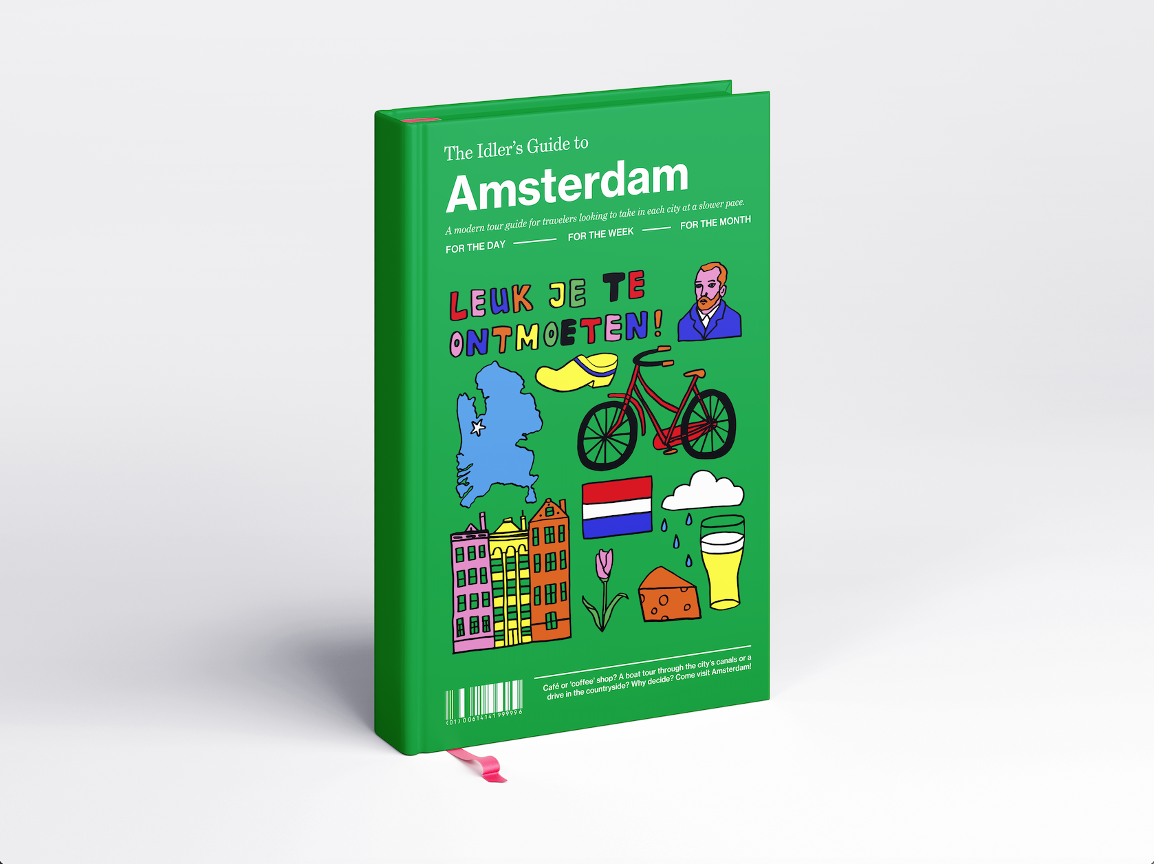
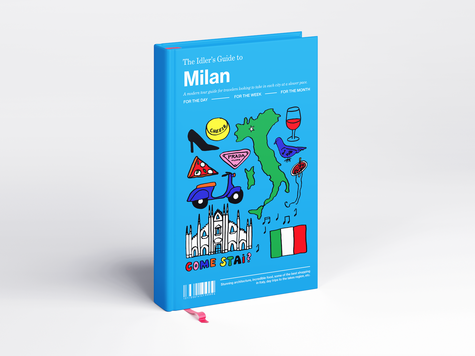
The Idler’s Guide,
Travel Guide Series, 2020.
This travel guide series, The Idler’s Guide, is centered around the idea of exploring new places at your own pace. The throughline to The Idler’s Guide are the three different travel agendas for each city for the reader to use based on the length of their visit— either a day, a week, or a month— with the days either being filled with the absolute must-see’s for those just passing through, to traveling off of the beaten path and seeing hidden gems for those choosing to stay a while. To continue this idea of juxtaposition, I also liked the idea of pairing the clean and formal text on the cover with handdrawn doodles that I scanned from my sketchbook to represent each city. À tout à l'heure!